UX Design to track the performance of the vendors for cross-functional teams.
Overview
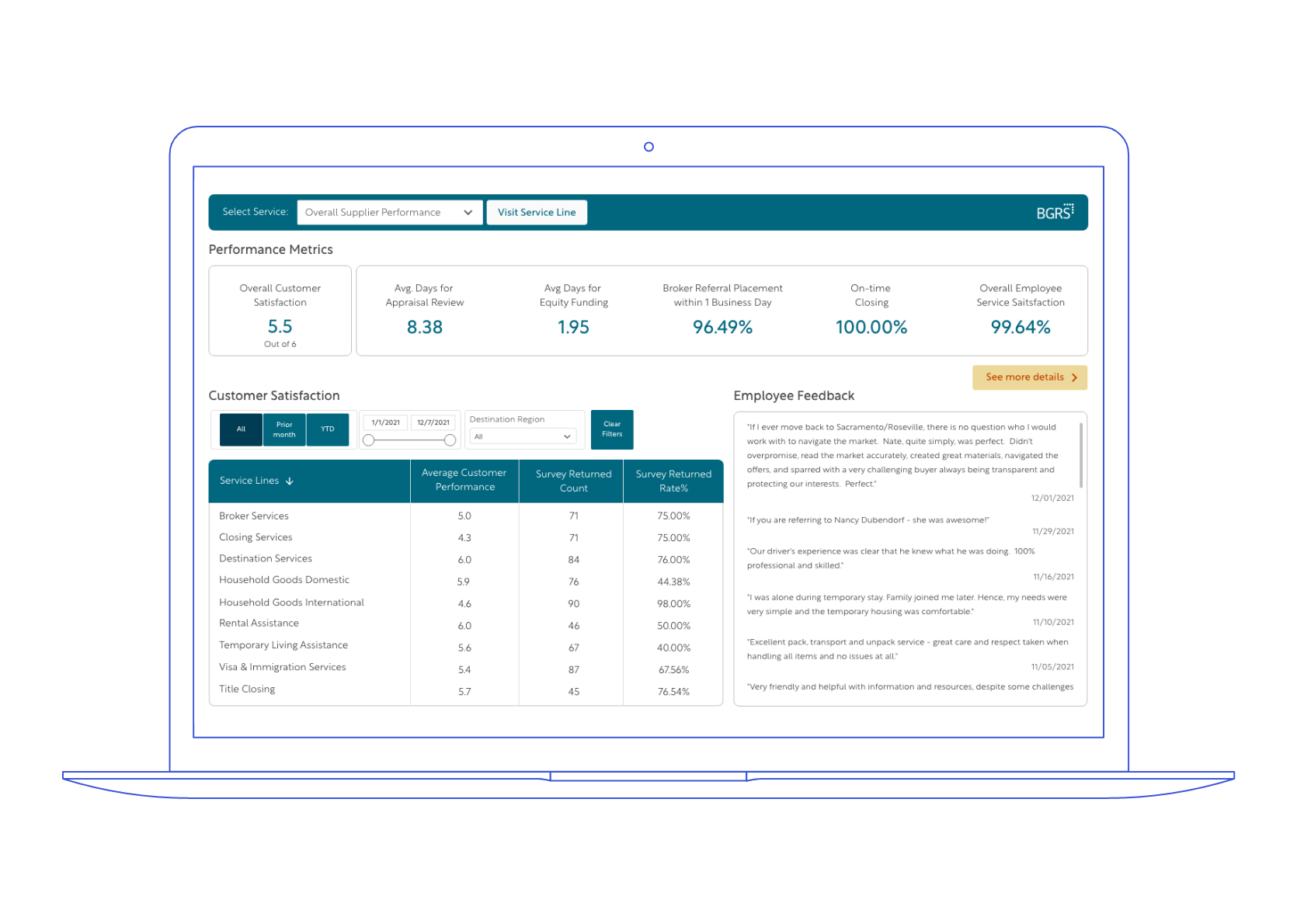
I designed a data-driven dashboard to assess the performance of suppliers based on end-user feedback. This dashboard consolidates multiple KPIs like customer ratings, product returns, survey responses, and claims data into an intuitive, interactive format.
Built using Power BI, the goal was to provide a centralized tool for faster, evidence-based decisions regarding supplier partnerships and quality control.
Problem
Stakeholders from different departments were facing challenges:
Accessing supplier performance data in one place
Making decisions without clear visibility of customer-related issues
Identifying which suppliers consistently underperformed or improved over time
Theyneeded a tool that offered clarity, consistency, and actionable insights based on real data.
Speed up decision-making around supplier management based on the surveys
A dashboard that delivers clear visuals, consistent data structure, and meaningful insights to help teams make informed, data-driven decisions.
Role
UX Designer
Type
Capstone Project
Tools
Adobe XD
Miro
Microsoft Teams
Google Suite
Duration
7-8 weeks
Discovery
Research
The company supports employee relocations by coordinating services like home inspections, real estate, moving, and visa assistance through a wide network of suppliers. However, there was no centralized way to track supplier performance.
Teams lacked visibility into key metrics, making it difficult to assess service quality or act on feedback. This led to the need for a dashboard that could provide clear, consistent, and actionable insights to support faster, data-driven decisions around supplier management.
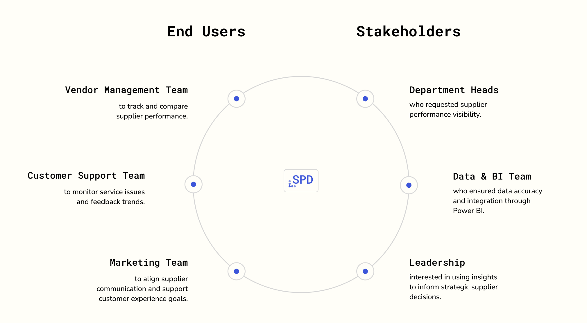
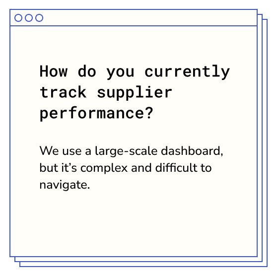
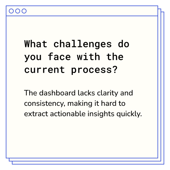
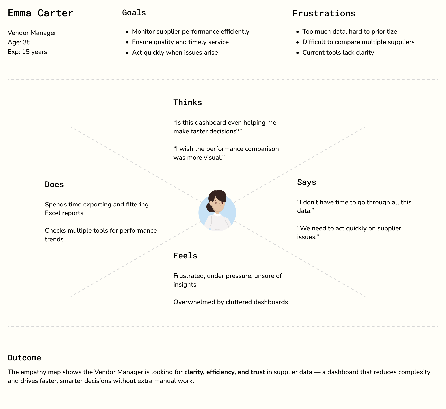
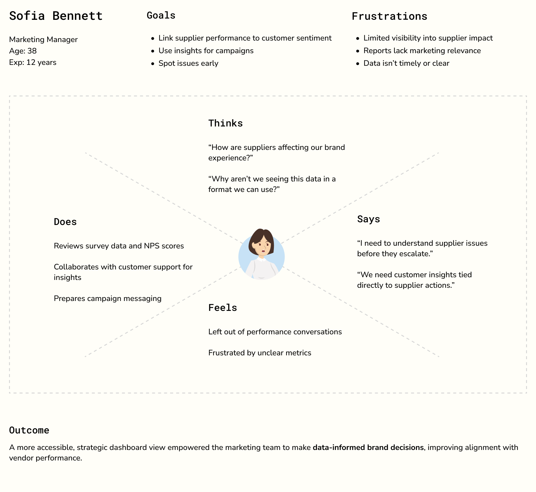
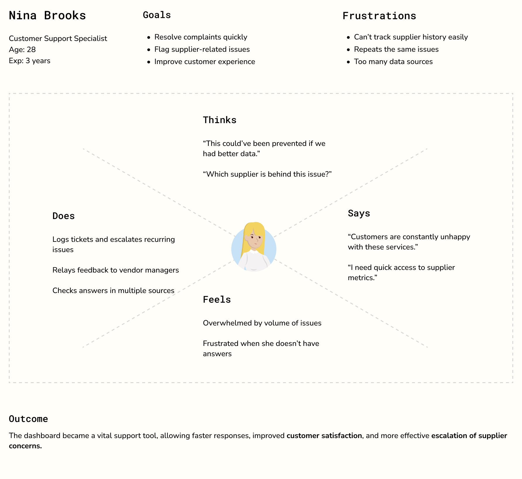
Stakeholder Interviews
To gain a deep understanding of how supplier performance was currently managed and the challenges faced, in-depth interviews with key stakeholders was conducted.
Summary
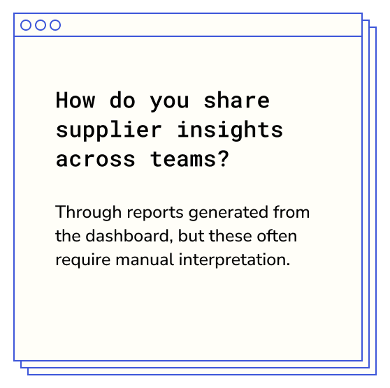
Stakeholders emphasized the need for a simplified, consistent dashboard that delivers clear, actionable insights to accelerate decision-making and improve supplier management.
The highlighted user stories after back to back meetings with the end users
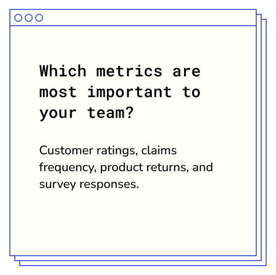
As a user, I want to view summarized insights so that I don’t have to sift through raw data.
As a user, I want to track return and claim patterns so that I can anticipate recurring problems.
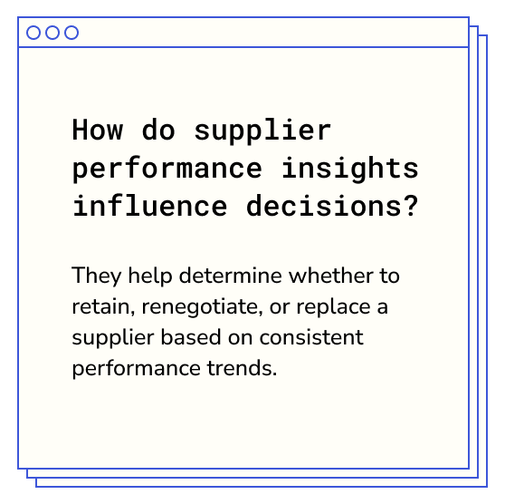
As a user, I want to identify top-performing suppliers so that we can highlight them in marketing materials.
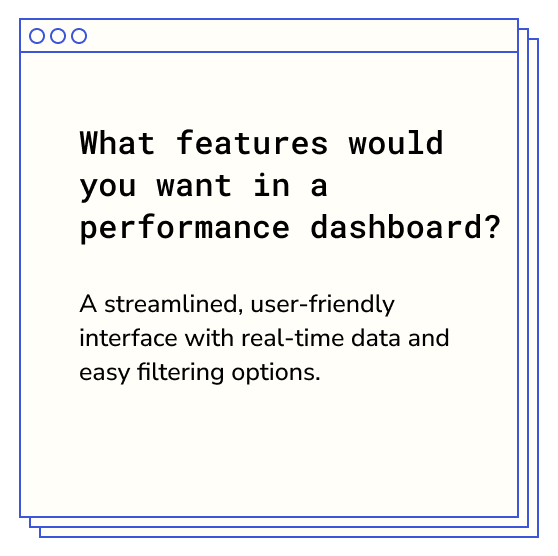
As a user, I want to filter performance data by region so that I can target location-specific improvements.
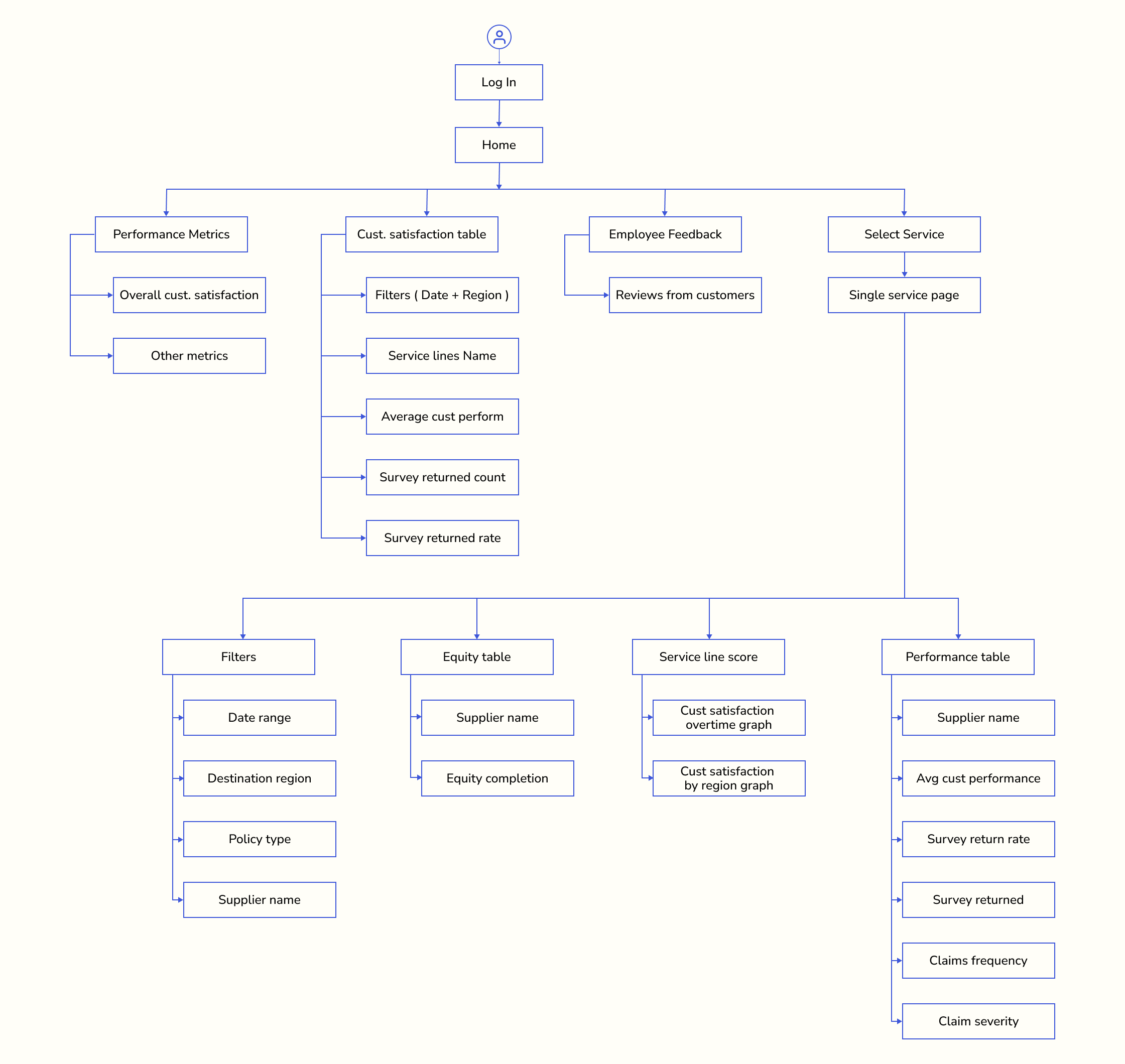
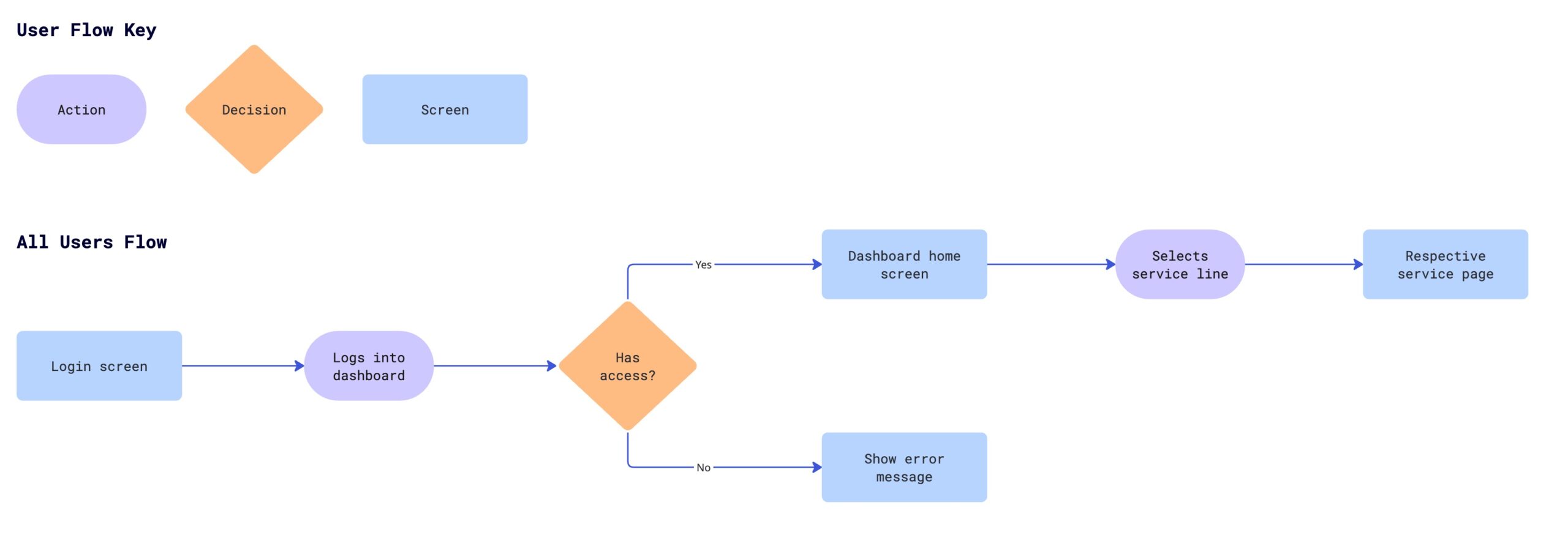
Information Architecture
User Flow
Wireframes
To visualize the solution early, I created low-fidelity wireframes focusing on core user needs and task flows. Since the final implementation was planned in Power BI, I had to account for its platform-specific constraints:
Design limitations: Power BI offers limited layout and customization options.
Visual components: Data visuals are restricted to predefined charts, cards, and filters.
Design
Style Guide
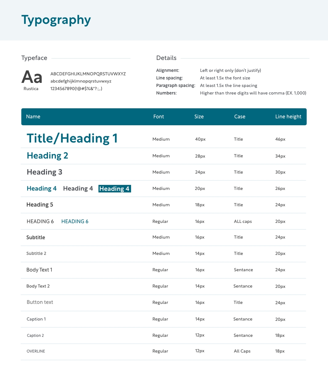
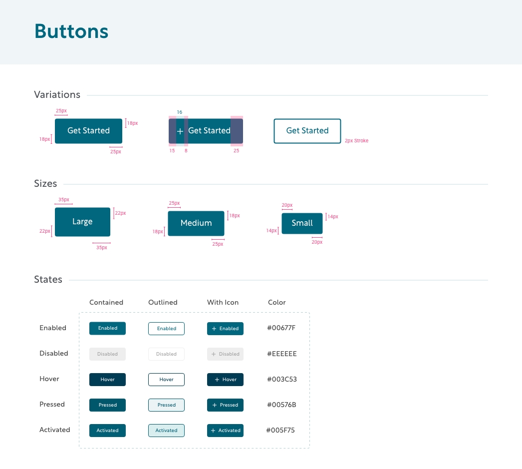
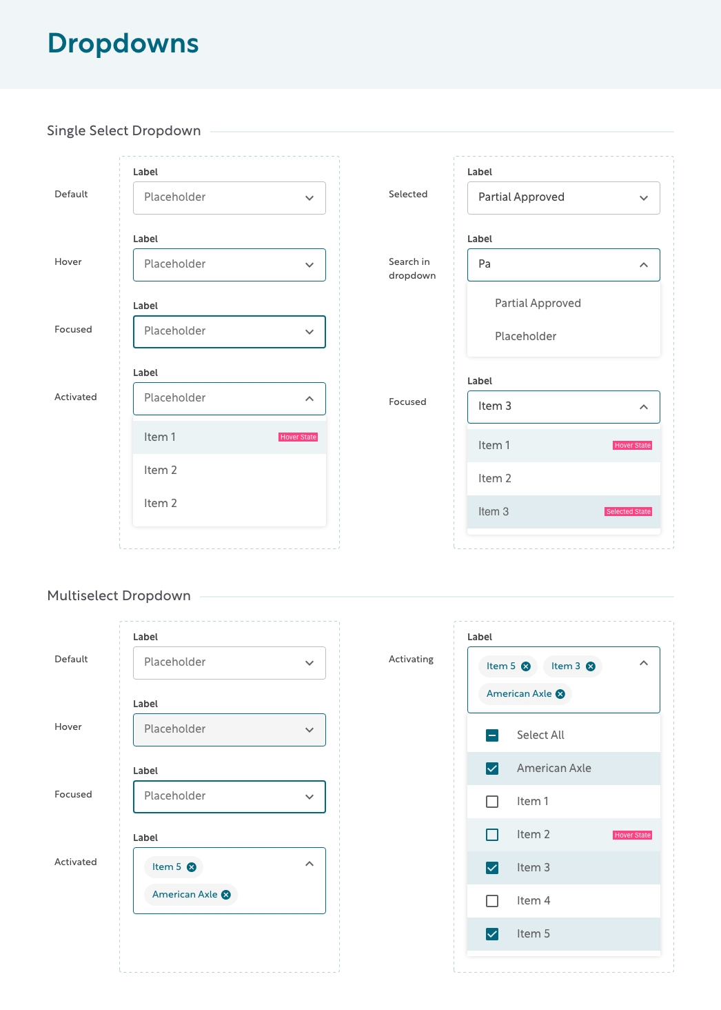
The visual design phase focused on aligning the user-centric layout with the organization’s existing brand identity. Since a style guide and branding guidelines were already in place, the designs had to strictly adhere to:
Predefined color palette and typography
Existing logo usage and visual consistency
Component styling (e.g., buttons, cards, filters) in line with the brand system
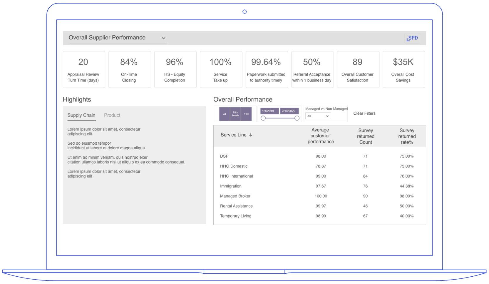
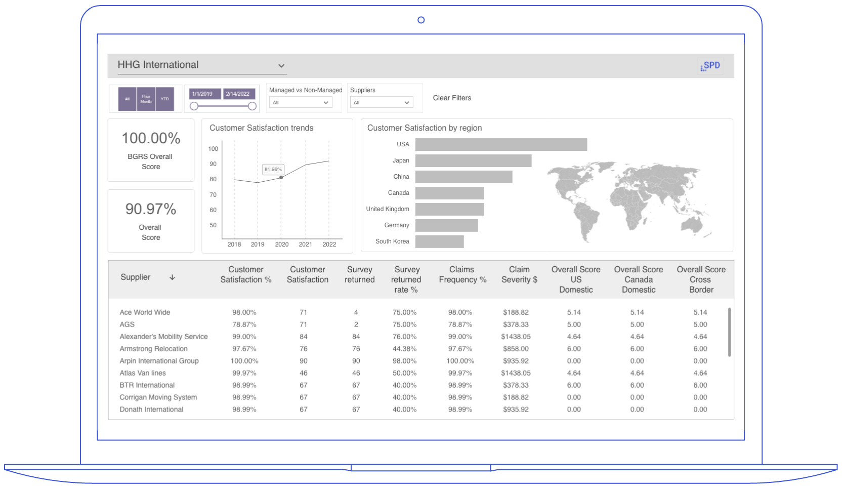
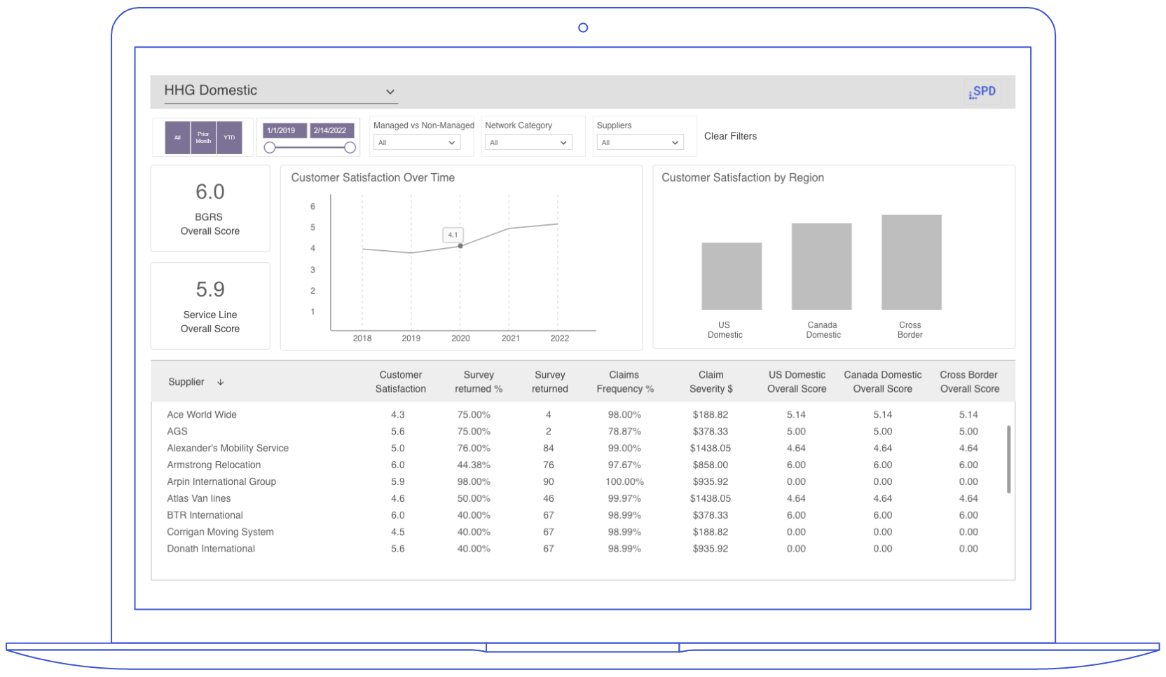
UI Iterations
The visual design phase focused on aligning the user-centric layout with the organization’s existing brand identity.
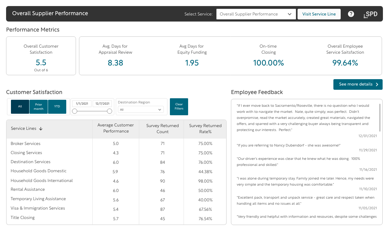
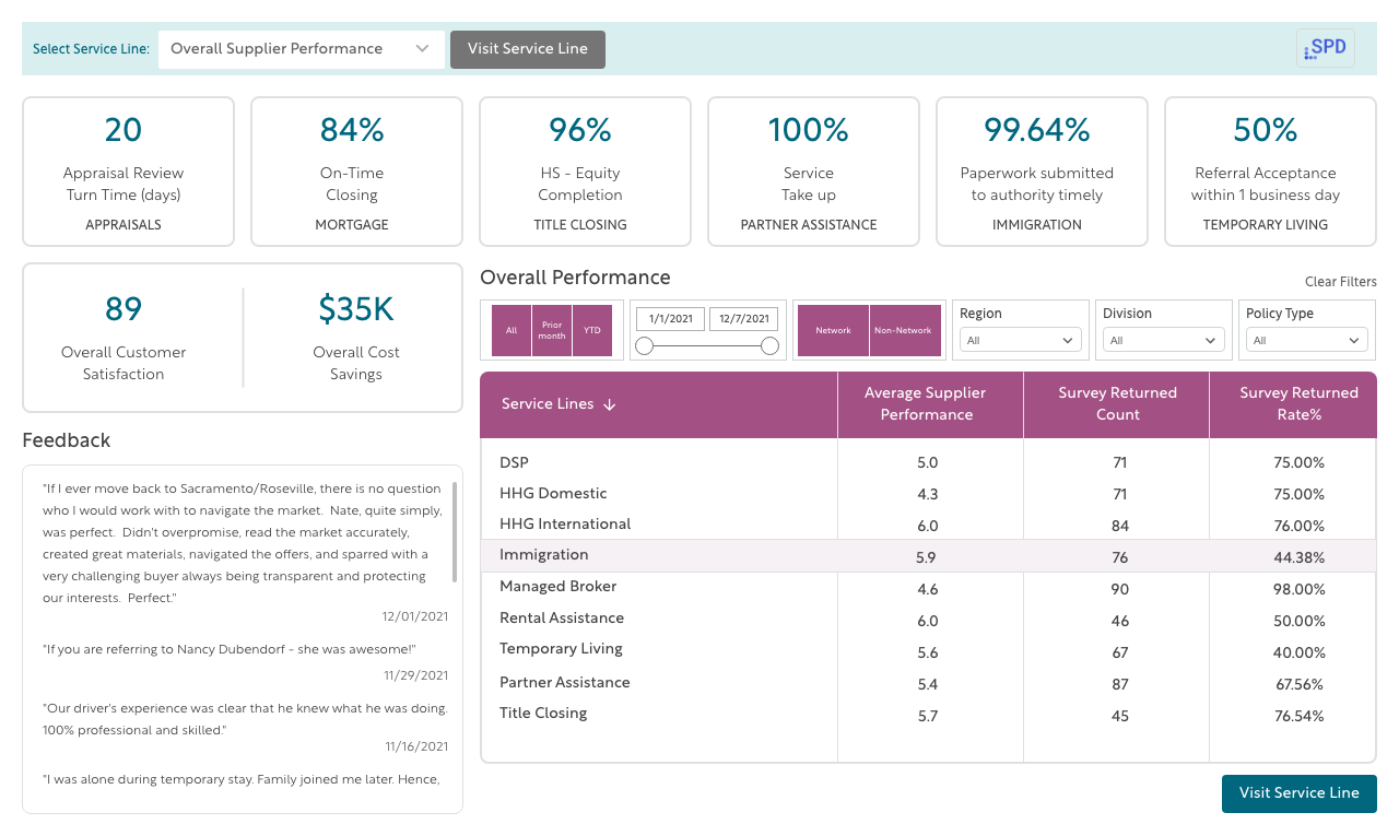
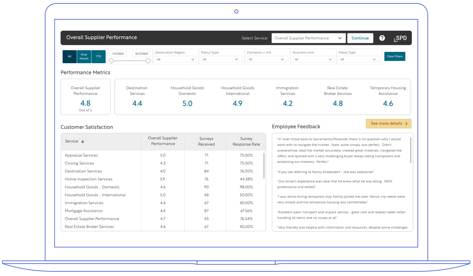
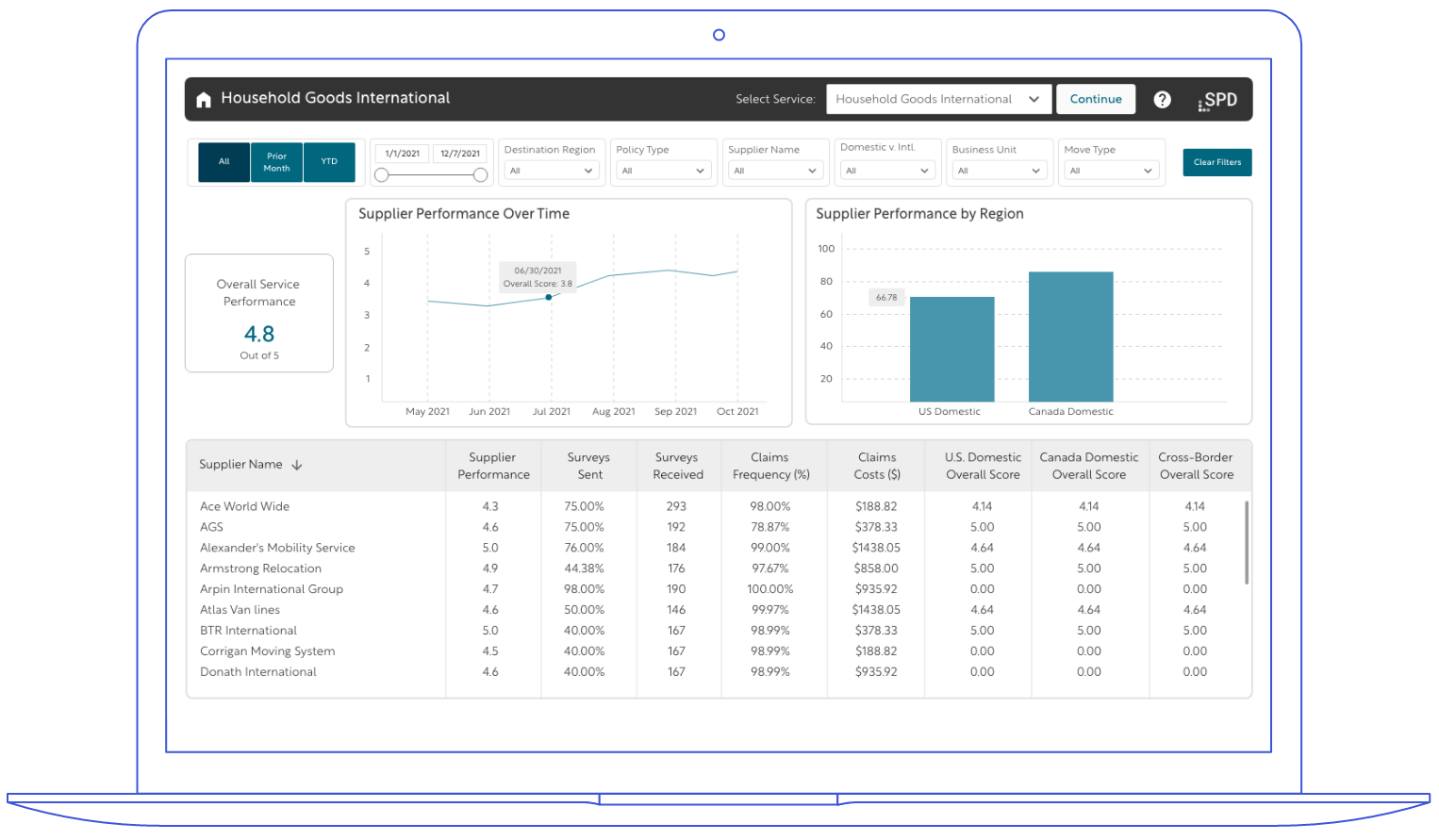
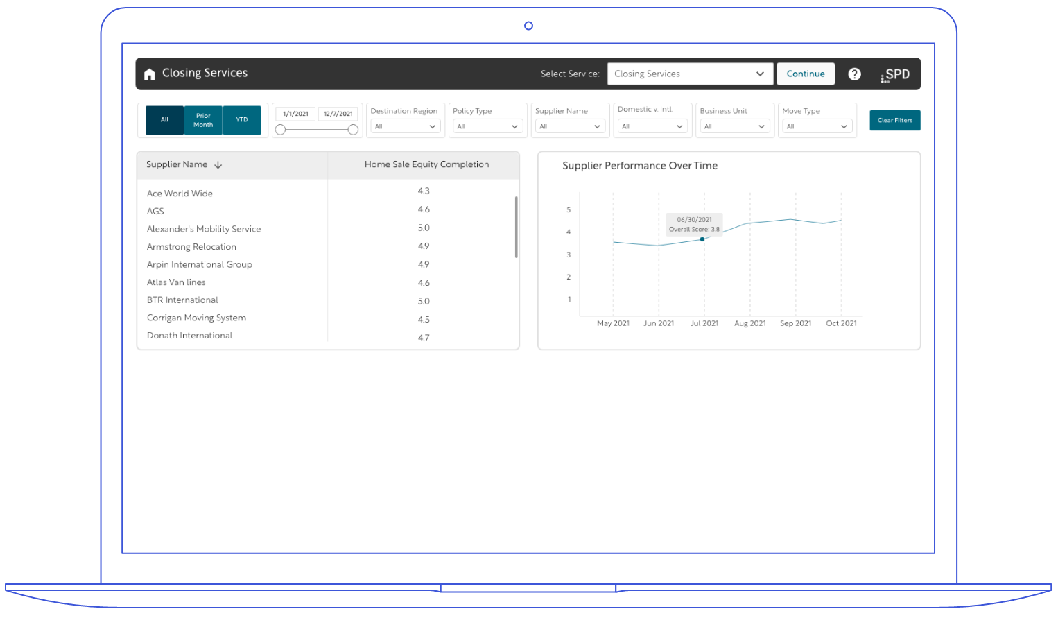
We created many dashboard iterations based on stakeholder feedback. Due to Power BI limitations, some features had to be simplified. The final design also followed the existing brand guidelines to ensure consistency.
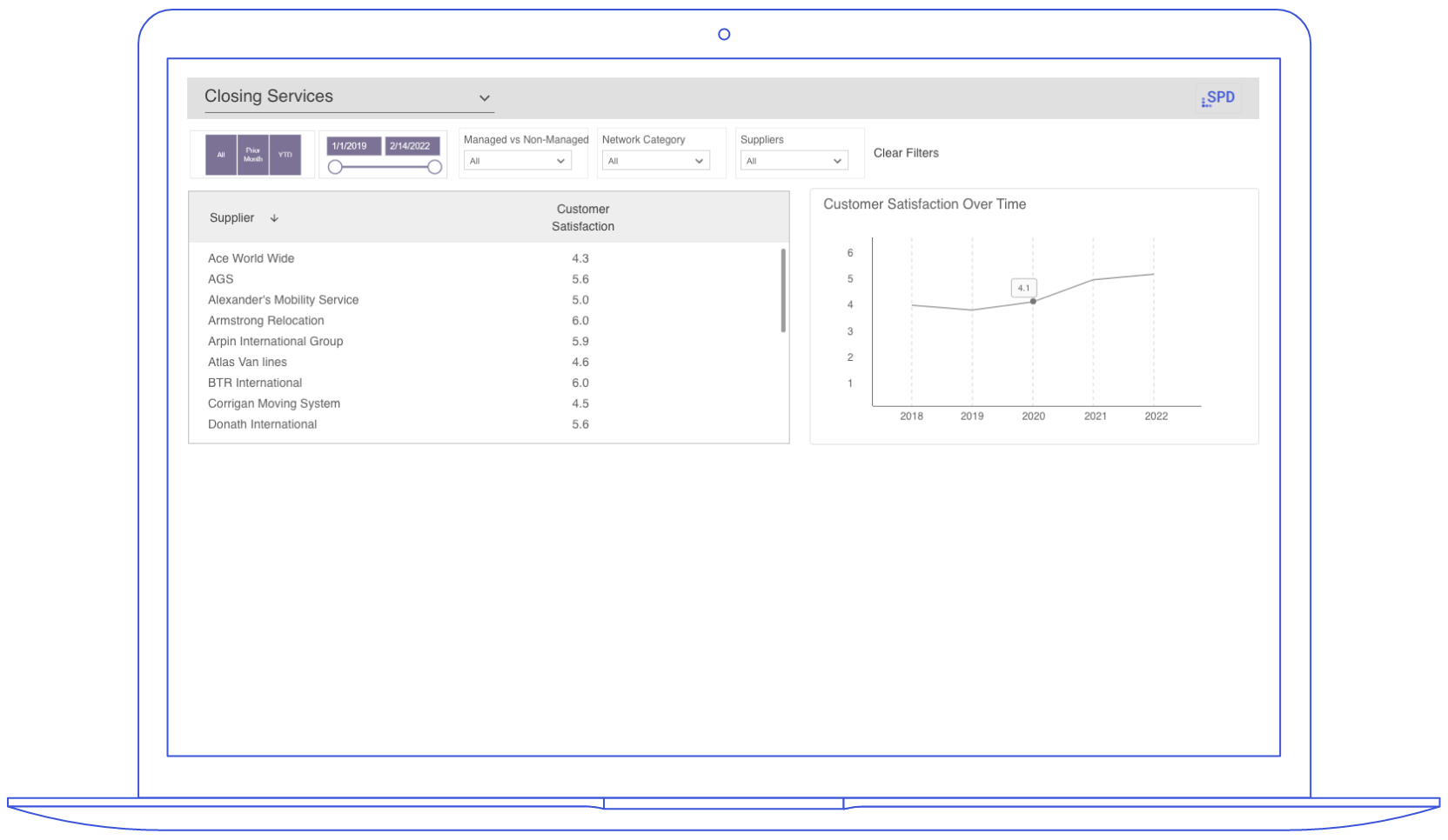
Iteration #1 (Final)
Iteration #2
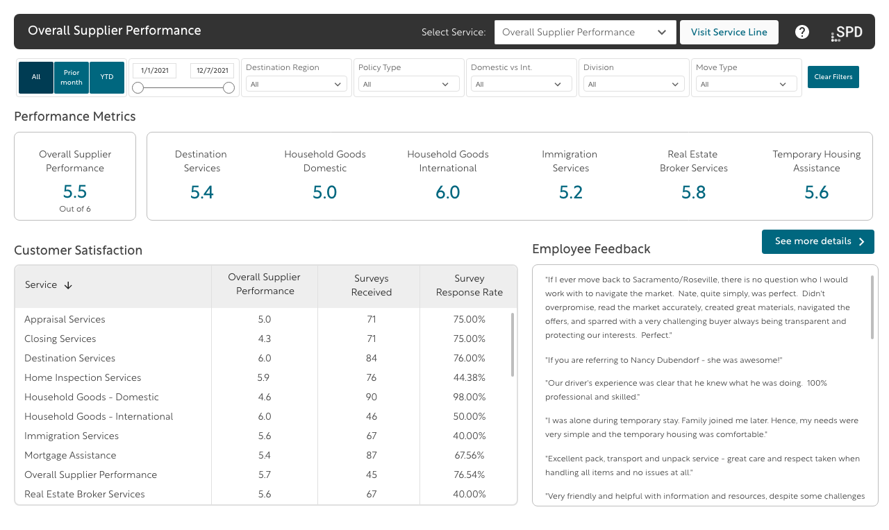
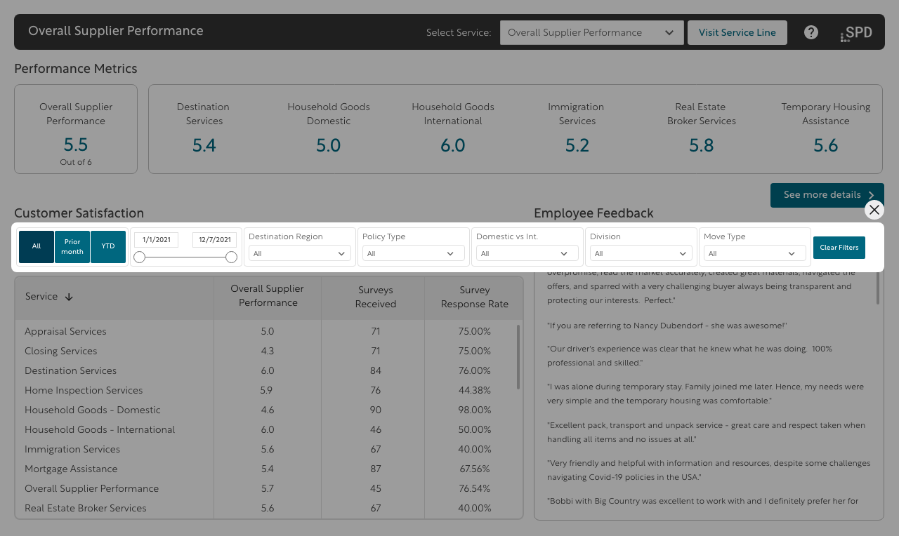
Filter Options
Several layout options were considered to fit filters within the limited space: full-width filters at the top, toggle panels, horizontal scroll, and pop-up on button click. Each had trade-offs in visibility and accessibility. The final choice balanced ease of use with visual simplicity, prioritizing quick access to key filters.
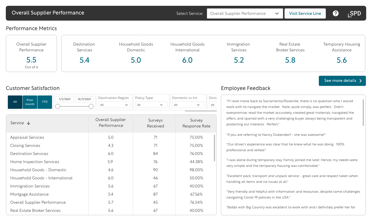
Usability Testing & Final Improvements
To validate the design, I conducted usability testing with 12 participants. The sessions focused on key tasks such as filtering, navigation, and completing the primary action. Feedback highlighted issues with button visibility, filter discoverability, and label clarity.
Based on this feedback, several refinements were made:
Primary action buttons were highlighted in yellow to distinguish them from secondary actions like filters.
Button labels were simplified to improve understanding and reduce friction.
The filter layout was streamlined for quicker access and better clarity.
These changes led to faster task completion, reduced confusion, and an overall improvement in user satisfaction.
Reflection
Reflection
This project was a valuable opportunity to improve the design with a clear focus on the needs and behaviour of the personas. By iterating on layouts, refining interactions, and simplifying language, the final solution became more intuitive and efficient for real users.
Usability testing reinforced how even small tweaks like button styling or clearer labels can significantly impact user confidence and task success. The design evolved into a more streamlined, user-friendlyexperience that directly supports the goals of the personas it was built for.
Next Steps
Although I’ve concluded my role on this project, the handoff included recommendations for continued improvements such as prototyping advanced features, ongoing usability testing, and enhancing dashboard customization. If continued, these efforts would help ensure the design remains intuitive and flexible for all users.